
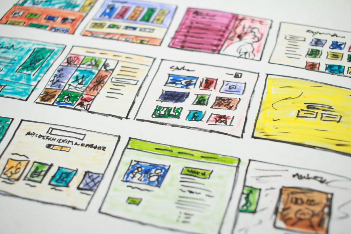
The first few minutes on a new gaming platform tend to decide more than people realise.
Before anyone gets properly into a game, they have already made a few quiet judgments.
Did the site load quickly? Was it obvious where to go? Did registration feel straightforward, or did it ask for too much too soon?
Could they find something worth trying without scrolling through endless menus?
That is why the best onboarding tends to be light. The Material Design guidance makes a similar point, recommending short, meaningful choices and a quick route into the main experience rather than forcing users through unnecessary setup screens.
For gaming platforms, that can mean a short account flow, a clear first screen and obvious categories rather than a tutorial that explains everything before the player has even had a chance to look around.
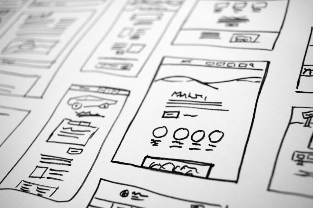
Small entry points can make a platform easier to test
The same idea applies to how much commitment a platform asks for at the beginning.
In mainstream gaming, players are already used to free demos, trial weekends, starter tiers, browser games and low-cost subscriptions.
These options let people get a feel for the service before deciding whether they want to spend more time or money on it.
That model has spread into other parts of online entertainment as well. In the online casino space, for example, a 5 euro deposit casino gives players a lower starting point, which can make it easier to test the platform, look at the game library and see how the payment flow works before making a larger commitment.
CasinoVergelijker notes that these low-deposit options are relatively rare and that minimum amounts can vary depending on the provider and payment method.
A new user can look around, try the games, see how the site works and then decide whether it is somewhere they actually want to keep using, making it easier to get a feel for it without committing much at the beginning.
Search and filters matter more than a big number
A platform can say it has hundreds or even thousands of games, but the number itself tells you very little about how easy those games are to find. This is where search, filters and categories start doing the real work.
A clear search box, sensible categories, a recently played section and filters that actually narrow things down can make a large library feel much smaller in the best possible way.
And on mobile, that matters even more. Nielsen Norman Group’s mobile UX guidance has long stressed how easily login walls, awkward forms and unnecessary steps can stop people before they have properly started.
Payment pages are part of the UX too
Payment screens are often treated as a separate technical area, but from the player’s perspective they are simply another part of the platform.
This is especially noticeable on platforms that support different payment methods, because the minimum amount can sometimes change depending on what the player chooses.
A €5 minimum through one method does not always mean the same minimum applies to another.
CasinoVergelijker makes exactly that point on its low-deposit guide, which is a useful reminder that clear payment information is part of good design, not just a financial detail.
The first useful action should be easy to find
There is another UX detail that sounds obvious but is often mishandled: once the player is inside, what should they do next? A good platform gives them somewhere obvious to go.

That might be a featured game, a short list of popular titles, a genre section or a search bar. What matters is that the page does not feel like a wall of equally important options.
Onboarding guidance recommends pushing users toward the first meaningful action rather than leaving them on a blank or confusing screen, and that principle works particularly well in gaming.
A player should not have to study the interface before they understand how to start.
Familiar design usually wins
People carry expectations from one platform to another.A search icon should look like a search icon. Account settings should be somewhere predictable.
Payment information should not be buried. Game tiles should give some clue about what kind of game sits behind them.
There is no prize for reinventing every familiar interface convention. The most comfortable gaming platforms often feel easy because they borrow patterns people already understand. That leaves more room for the games themselves to feel different.
Good UX is mostly made of things players barely notice
Most players probably would not mention any of this if you asked them what makes a platform feel good to use. They would talk about the games first, maybe the graphics or how quickly everything runs.
But underneath that, the quieter parts still matter: a short registration flow, clear categories, useful search, obvious payment information and a first step that does not require instructions.
Those details do not need to be flashy. In fact, they probably work best when they are not.
A gaming platform becomes easier to try when it asks less of the player at the start and makes the important things easy to find.
That is what good UX usually comes down to: not adding more, but removing the little points of friction that make a new platform feel harder than it needs to be.